CAN-SPAM Act: A Compliance Guide for Business
FTC www.ftc.gov/spam
U.S. CAN-SPAM ACT
http://thomas.loc.gov/cgi-bin/query/z?c108:s.877.enr:
U.S. State by State laws regarding Spam
http://www.ncsl.org/programs/lis/legislation/spamlaws02.htm
U.S. CAN-SPAM ACT
http://thomas.loc.gov/cgi-bin/query/z?c108:s.877.enr:
U.S. State by State laws regarding Spam
http://www.ncsl.org/programs/lis/legislation/spamlaws02.htm
Google GMail Rules
Hotmail Anti-Spam policy
AOL Bulk Sender Best Practices
Yahoo Best practices for senders
CAN-SPAM Act: A Compliance Guide for Business
14 Ground Rules Email Template Design Must Follow
Before getting into specific details of HTML coding for email newsletters, the most important concept for marketers to understand is that developing them is drastically different than coding a standard Web page – even taking into consideration legacy browser standards. The major browser based email services such as Gmail, Hotmail, Yahoo!, and AOL are all light years behind current browser rendering capabilities. And then, of course, there’s Microsoft’s Outlook program. Since Office 2007, Microsoft changed their rendering engine from Internet Explorer’s to that of Word. Feel free to take a moment to try and wrap your head around why a company would swap their layout engine from a web browser to a word processor. These are the kind of obstacles you have to deal with in the strange world of email coding. Let’s get started on 14 ground rules developers should always adhere when creating HTML email templates:
- DOCTYPE Declaration
<! DOCTYPE html PUBLIC "-//W3C//DTD XHTML 1.0 Transitional//EN" "http://www.w3.org/TR/xhtml1/DTD/xhtml1-transitional.dtd">
<html xmlns="http://www.w3.org/1999/xhtml">
- META TAG
<meta http-equiv="content-type" content="text/html; charset=UTF-8">
- TITLE
A maximum amount of 70 characters will display in the search results.
- SBJECT LINE
- Keep your subject line short – 40-50 characters.
- Don’t Use All Caps Letters
- HTML
- Staying Center
- Use Tables only
- TABLE
Width less than 600px
- CSS
- Use Inline CSS
- Do not use external style sheets
They will not work in a lot of the email clients and you should be including all of your CSS using inline CSS within your HTML. - Do not use CSS classes - always use inline CSS
Many email clients do not support CSS classes. Instead of declaring CSS classes you should use inline CSS. An example would be <div style="color:#cccccc;">content</div> instead of <div class="cssclassa">content</div> - Avoid using CSS float or position options
Some email clients will disregard both the float and position CSS options. Try to use tables instead.
- IMG
<img src=”images/email_logo.jpg” alt=”” border=”0” style=”display: block;” border=”0” align=”absbottom”/>
- Each Image Size 30kb not more than that
- Avoid PNGs
Lotus Notes 6 and 7 don’t support 8-bit or 24-bit PNG images, so stick with the GIF or JPG formats for all images, even if it means some additional file size.
- Use the display hack for Outlook.com
For some inexplicable reason, Outlook.com adds a few pixels of additional padding below images. A workaround is to set the display property like so.
img {display: block;}
This removes the padding in Outlook.com and still gives you the predictable result in other email clients.
Hotmail Bug Fixes
<img src=”image.jpg” style=”display: block ;”>
- FONT
- Avoid shorthand for fonts and hex notation
A number of email clients reject CSS shorthand for the font property. For example, never set your font styles like this.
span { font:bold 1em/1.2em georgia,times,serif; }
Instead, declare the properties individually like this.
span {
Font-weight: bold;
Font-size: 1em;
Line-height: 1.2em;
Font-family: Ariel;
}
- TEXT
- Align your Text
Any <td> that contains text should have the align=”” command with desired alignment selected. When viewing email in a Web-based client using Internet Explorer, text is often automatically aligned center. If you wish your text to be left aligned, for example, you must apply <td align=”left”> to the containing <td>.
- Text styling
Make sure to style each block of text separately. While tedious, if every element’s font attribute is not directly addressed, a lot of the email clients will use their own ugly default serif fonts.
- LINKS
<a href="http://somesite.com/" style="color:#ff00ff; outline :none; border:0px;">this is a link</a>
- Some More...
- Don’t Use Java Script
Almost every email client will read this as spam and dispose of it. Sure it might look great to you to have all kinds of popups and stuff. But its going to kill the email, so don’t do it!
- Don’t Use Div’s (Floats don’t Support)
- Heading Tags(don’t Work All Clients)
- Don’t use font tag
- Don’t use % padding margin
- Don’t use P & Heading Tags
GOOD PERFORMER
- font, font-family, font-size, font-weight, font-style
- text-align, line-height, text-decoration, text-indent
- color, background-color
- border
- height, width
INCONSISTENT PERFORMER
- background, background-image,
- background-position
- margin, padding
- :hover, :visited, :active
- clear
- display
- float
AVOID IF POSSIBLE
- text-overflow, text-shadow
- position, z-index
- list-style-image
- opacity
- border-image, border-radius
- box-shadow
- Font tag
- top, right, bottom, left
- SPAM
- Don’t Use All Caps
- Don’t Use for Red Color Fonts For links & Texts(Try to Avoid Maximum)
- Don’t Use Spam Key Words Ex:
14. Your campaign should include an equal image-to-text ratio:
- A maximum of 40% image coverage
- A minimum 60% text coverage
- More than 3 images in the page – if any at all.
- Not all images touching
- At least 400 characters of text
The ideal width for an email is between 550 and 600 pixels, though we have seen emails that operate just fine at as much as 700 pixels!Why is this fixed email width important to your email marketing program? Remember that your email will not be displayed as an entire screen. It will be locked within the size of the display box of an email service provider or Outlook client. While the size of those boxes may vary, 600 pixels is a safe width to use to ensure that the entire width of your email displays in a user's preview box or email pane. Remember, nobody is going to use a horizontal scroll bar within an email.
The Ideal Email Height for an Email Template
Obviously, your email template can be as long as needed to accommodate the amount of text that you put in it. Just remember that the longer your email is, the less likely users are to see the content, offers, or promotions that are at the bottom of it. Also, remember how important it is that the most important text be shown above-the-fold, or in "email speak" within the preview pane of a typical email client. That preview pane will usually be between 300 and 500 pixels high. Be sure to optimize that space to feature as much content, promotion, and teaser as possible to encourage users to scroll further.
What's Best?
It is a good idea to keep your emails to a fixed width of no more than 550-600 pixels.
Height 300px to 500px This should ensure that in the majority of cases, your subscribers can view your email as you intended.
Live Code:
1. Every Images need have all these Property's
alt="" align="absbottom" border="0" style="display:block;"
If Responsive
Width="100%" alt="" align="absbottom" border="0" style=" max-width:600px; display:block;"
2. Anchor tag need have all these Property's
style="outline:none; border:0px;"
- Responsive Template Live Code Responsive
<!DOCTYPE html PUBLIC "-//W3C//DTD XHTML 1.0 Transitional//EN" "http://www.w3.org/TR/xhtml1/DTD/xhtml1-transitional.dtd">
<html xmlns="http://www.w3.org/1999/xhtml">
<head>
<meta http-equiv="Content-Type" content="text/html; charset=utf-8" />
<title>Way2inbox</title>
</head>
<body>
<table width="100%" border="0" cellspacing="0" cellpadding="0" style="max-width:600px; font-family:Verdana, Geneva, sans-serif; font-size:13px; line-height:22px; color:#000000;">
<tr>
<td>
<a style="outline:none; border:0px;" href="http://tracking.themailclub.co.in/aff_c?offer_id=690&aff_id=1078" target="_blank">
<img src="images/right_choice_01.jpg" width="100%" alt="" align="absbottom" border="0" style=" max-width:600px; display:block;"/></a>
</td>
</tr>
<table>
</body>
</html>
4. Regular Template Live Code Example:
<!DOCTYPE html PUBLIC "-//W3C//DTD XHTML 1.0 Transitional//EN" "http://www.w3.org/TR/xhtml1/DTD/xhtml1-transitional.dtd">
<html xmlns="http://www.w3.org/1999/xhtml">
<head>
<meta http-equiv="Content-Type" content="text/html; charset=utf-8" />
<title>Way2inbox</title>
</head>
<body>
<table width="600" border="0" cellspacing="0" cellpadding="0" style="font-family:Verdana, Geneva, sans-serif; font-size:13px; line-height:22px; color:#000000;">
<tr>
<td>
<a style="outline:none; border:0px; color:#0000ef; tex-decoration:none; fon-size:16px; font-weight:bold;" href="http://www.way2sms.com" target="_blank">Way2inbox</a>
</td>
</tr>
<tr>
<td>
<a style="outline:none; border:0px;" href="http://tracking.themailclub.co.in/aff_c?offer_id=690&aff_id=1078" target="_blank">
<img src="images/right_choice_01.jpg" width="600" alt="" align="absbottom" border="0" style="display:block;"/></a>
</td>
</tr>
<table>
</body>
</html>
Thank You........
Responsive Email template Design
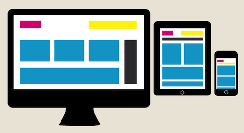
You know that we are living in a Multi-screen World, and I am a Multi-screen girl. I’m on my phone while I am watching TV just like 81% of you out there according to Google. I am switching from PC to Smart Phone to Tablet and every combination in-between all day, every day and so are your email subscribers.
Did you know that more than half your email opens could be coming from mobile? Mobile Email Opens have increased 123% over the last 18 Months, accounting for more than 60% of opens on some campaigns according to recent data from Litmus.

New research from Pew Internet says 45% of American adults have a smartphone and 25% have a tablet. Has your email template been optimized for both of these platforms? Last year the amount of tablet owners nearly doubled around the holiday season so that 25% probably isn’t even close to reality post December 25th.
- Gives each screen a custom experience that is modeled to fit usage patterns.
- Hides and moves content to keep your brand message in clear view on all screens.
- Optimizes call to action placement to maximize clicks.
- Eliminates the friction of subscribers having to squint and zoom.
- Improves the overall email viewing experience on every screen.
While the devices might do a decent job of displaying what you created, chances are that your overall email experience is optimal on a computer unless you have adapted a Responsive Design. Making sure your emails render across platforms isn’t going to be enough to keep your mobile/tablet conversion rates the same as you see on the computer. Different screens deliver different experiences with different levels of engagement and usage patterns.
How does Responsive Design increase email conversions?
Don’t rely on subscriber’s devices to render your emails optimally. It’s a recipe for a slow decline of your conversion rates. Your subscribers are moving from device to device and your email has to move with them. Update your templates to Responsive Design to increase conversion rates and give your subscribers the best experience on every screen.
Contact us (sandeepreddynarra@gmail.com) a responsive email template design for your email marketing campaigns.
Responsive Template Live Code Responsive
<!DOCTYPE html PUBLIC "-//W3C//DTD XHTML 1.0 Transitional//EN" "http://www.w3.org/TR/xhtml1/DTD/xhtml1-transitional.dtd">
<html xmlns="http://www.w3.org/1999/xhtml">
<head>
<meta http-equiv="Content-Type" content="text/html; charset=utf-8" />
<title>Way2inbox</title>
</head>
<body>
<table width="100%" border="0" cellspacing="0" cellpadding="0" style="max-width:600px; font-family:Verdana, Geneva, sans-serif; font-size:13px; line-height:22px; color:#000000;">
<tr>
<td>
<a style="outline:none; border:0px;" href="http://tracking.themailclub.co.in/aff_c?offer_id=690&aff_id=1078" target="_blank">
<img src="images/right_choice_01.jpg" width="100%" alt="" align="absbottom" border="0" style=" max-width:600px; display:block;"/></a>
</td>
</tr>
<table>
</body>
</html>