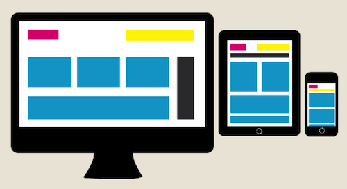
You know that we are living in a Multi-screen World, and I am a Multi-screen girl. I’m on my phone while I am watching TV just like 81% of you out there according to Google. I am switching from PC to Smart Phone to Tablet and every combination in-between all day, every day and so are your email subscribers.
Did you know that more than half your email opens could be coming from mobile? Mobile Email Opens have increased 123% over the last 18 Months, accounting for more than 60% of opens on some campaigns according to recent data from Litmus.

New research from Pew Internet says 45% of American adults have a smartphone and 25% have a tablet. Has your email template been optimized for both of these platforms? Last year the amount of tablet owners nearly doubled around the holiday season so that 25% probably isn’t even close to reality post December 25th.
- Gives each screen a custom experience that is modeled to fit usage patterns.
- Hides and moves content to keep your brand message in clear view on all screens.
- Optimizes call to action placement to maximize clicks.
- Eliminates the friction of subscribers having to squint and zoom.
- Improves the overall email viewing experience on every screen.
While the devices might do a decent job of displaying what you created, chances are that your overall email experience is optimal on a computer unless you have adapted a Responsive Design. Making sure your emails render across platforms isn’t going to be enough to keep your mobile/tablet conversion rates the same as you see on the computer. Different screens deliver different experiences with different levels of engagement and usage patterns.
How does Responsive Design increase email conversions?
Don’t rely on subscriber’s devices to render your emails optimally. It’s a recipe for a slow decline of your conversion rates. Your subscribers are moving from device to device and your email has to move with them. Update your templates to Responsive Design to increase conversion rates and give your subscribers the best experience on every screen.
Contact us (sandeepreddynarra@gmail.com) a responsive email template design for your email marketing campaigns.
Responsive Template Live Code Responsive
<!DOCTYPE html PUBLIC "-//W3C//DTD XHTML 1.0 Transitional//EN" "http://www.w3.org/TR/xhtml1/DTD/xhtml1-transitional.dtd">
<html xmlns="http://www.w3.org/1999/xhtml">
<head>
<meta http-equiv="Content-Type" content="text/html; charset=utf-8" />
<title>Way2inbox</title>
</head>
<body>
<table width="100%" border="0" cellspacing="0" cellpadding="0" style="max-width:600px; font-family:Verdana, Geneva, sans-serif; font-size:13px; line-height:22px; color:#000000;">
<tr>
<td>
<a style="outline:none; border:0px;" href="http://tracking.themailclub.co.in/aff_c?offer_id=690&aff_id=1078" target="_blank">
<img src="images/right_choice_01.jpg" width="100%" alt="" align="absbottom" border="0" style=" max-width:600px; display:block;"/></a>
</td>
</tr>
<table>
</body>
</html>
0 comments:
Post a Comment